
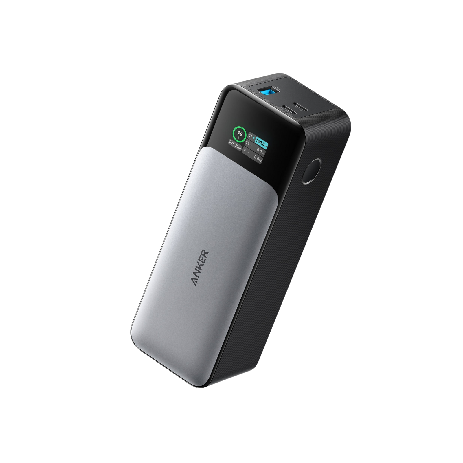
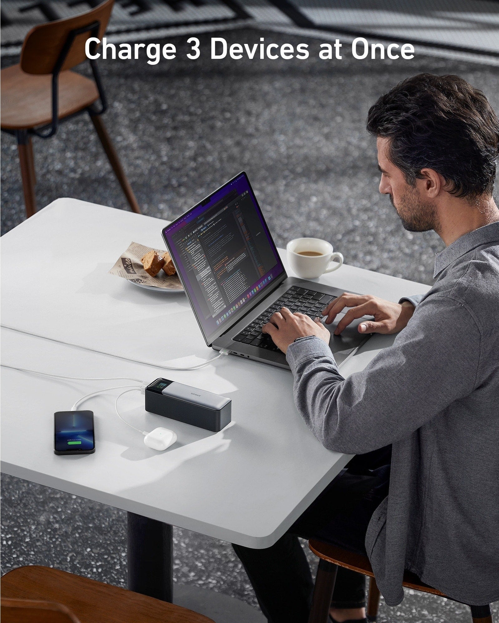
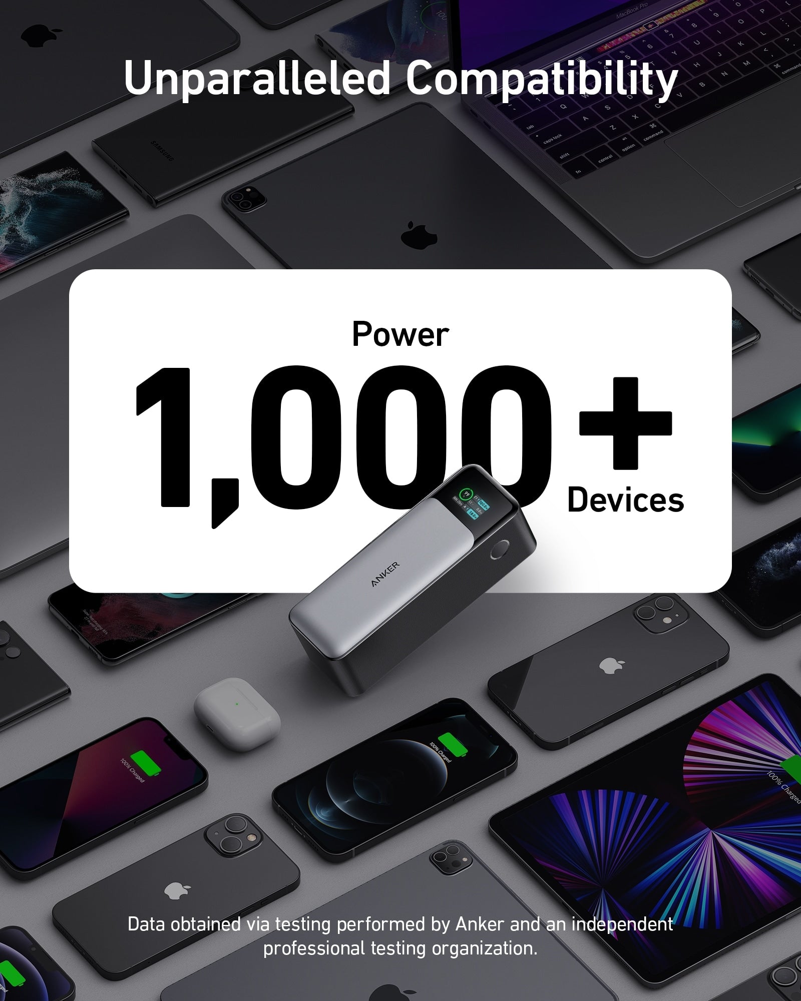
Anker 737 Power Bank (PowerCore 24K)
Original price was: CA$109.99.CA$39.00Current price is: CA$39.00. 65% Off Sale
Description
@import url(‘https://fonts.googleapis.com/css2?family=DM+Sans:wght@400;500;600;700;800&family=Manrope:wght@400;500;600;700;800&display=swap’);
:root {
–red: #e5232e;
–red-light: #fff1f2;
–black: #171717;
–gray: #777;
–line: #eaeaea;
–soft: #f7f7f7;
}
* {
box-sizing: border-box;
}
html {
scroll-behavior: smooth;
}
body {
margin: 0;
color: var(–black);
background: #fff;
font-family: ‘DM Sans’, sans-serif;
}
a {
color: inherit;
text-decoration: none;
}
.container {
width: min(1160px, calc(100% – 48px));
margin: auto;
}
.section {
padding: 90px 0;
}
.eyebrow {
color: var(–red);
font-size: 10px;
font-weight: 800;
letter-spacing: 2.5px;
text-transform: uppercase;
}
.section-title {
margin: 16px 0 20px;
font-family: ‘Manrope’, sans-serif;
font-size: clamp(36px, 5vw, 58px);
line-height: 1.08;
font-weight: 800;
letter-spacing: -2.8px;
}
.red {
color: var(–red);
}
.description {
color: var(–gray);
font-size: 14px;
line-height: 1.95;
}
/* TOP NAV */
.navbar {
position: sticky;
top: 0;
z-index: 50;
background: rgba(255,255,255,.96);
backdrop-filter: blur(12px);
border-bottom: 1px solid var(–line);
}
.nav-inner {
min-height: 58px;
display: flex;
align-items: center;
justify-content: center;
}
.nav-menu {
display: flex;
justify-content: center;
align-items: center;
flex-wrap: wrap;
gap: 35px;
}
.nav-menu a {
color: #555;
font-size: 11px;
font-weight: 700;
transition: color .2s;
}
.nav-menu a:hover {
color: var(–red);
}
/* HERO */
.hero {
padding: 95px 0 85px;
background: #fff;
}
.hero-grid {
display: grid;
grid-template-columns: 1.1fr .9fr;
gap: 70px;
align-items: center;
}
.hero-label {
display: flex;
align-items: center;
gap: 12px;
color: #999;
font-size: 10px;
font-weight: 800;
letter-spacing: 2px;
}
.hero-label::before {
content: “”;
width: 28px;
height: 2px;
background: var(–red);
}
.hero h1 {
margin: 27px 0 23px;
font-family: ‘Manrope’, sans-serif;
font-size: clamp(55px, 7.5vw, 90px);
line-height: .98;
font-weight: 800;
letter-spacing: -5px;
}
.hero h1 span {
display: block;
color: var(–red);
}
.hero-description {
max-width: 520px;
color: #777;
font-size: 14px;
line-height: 2;
}
.hero-meta {
display: flex;
flex-wrap: wrap;
gap: 25px;
margin-top: 35px;
padding-top: 22px;
border-top: 1px solid var(–line);
}
.hero-meta div {
color: #999;
font-size: 10px;
letter-spacing: 1px;
}
.hero-meta strong {
display: block;
margin-bottom: 7px;
color: #222;
font-family: ‘Manrope’, sans-serif;
font-size: 16px;
letter-spacing: 0;
}
/* HERO PANEL */
.hero-panel {
min-height: 390px;
padding: 35px;
display: flex;
flex-direction: column;
justify-content: space-between;
position: relative;
overflow: hidden;
background: var(–red-light);
border: 1px solid #f5dfe1;
}
.hero-panel::before {
content: “24K”;
position: absolute;
right: -10px;
bottom: 20px;
color: rgba(229,35,46,.07);
font-family: ‘Manrope’, sans-serif;
font-size: 175px;
font-weight: 800;
letter-spacing: -13px;
}
.panel-top,
.panel-bottom,
.panel-middle {
position: relative;
z-index: 1;
}
.panel-top {
display: flex;
justify-content: space-between;
align-items: center;
}
.panel-tag {
padding: 8px 12px;
color: var(–red);
background: white;
font-size: 9px;
font-weight: 800;
letter-spacing: 1.5px;
}
.panel-model {
color: #999;
font-size: 10px;
font-weight: 700;
letter-spacing: 1.5px;
}
.panel-middle {
padding: 35px 0;
}
.panel-number {
color: var(–red);
font-family: ‘Manrope’, sans-serif;
font-size: clamp(65px, 9vw, 100px);
font-weight: 800;
line-height: .95;
letter-spacing: -7px;
}
.panel-unit {
margin-top: 12px;
font-size: 11px;
font-weight: 800;
letter-spacing: 3px;
}
.panel-bottom {
display: flex;
justify-content: space-between;
gap: 20px;
padding-top: 20px;
border-top: 1px solid #edcccc;
}
.panel-bottom strong {
display: block;
font-family: ‘Manrope’, sans-serif;
font-size: 20px;
font-weight: 800;
}
.panel-bottom span {
display: block;
margin-top: 5px;
color: #888;
font-size: 9px;
letter-spacing: 1px;
}
/* QUICK SPECS */
.quick-specs {
background: var(–black);
color: #fff;
}
.quick-grid {
display: grid;
grid-template-columns: repeat(4, 1fr);
}
.quick-item {
padding: 30px 22px;
border-right: 1px solid #393939;
}
.quick-item:last-child {
border: 0;
}
.quick-item strong {
display: block;
font-family: ‘Manrope’, sans-serif;
font-size: 34px;
line-height: 1;
letter-spacing: -1px;
}
.quick-item strong span {
color: #ff5961;
}
.quick-item small {
display: block;
margin-top: 12px;
color: #aaa;
font-size: 9px;
font-weight: 700;
letter-spacing: 1.5px;
}
/* INTRO */
.intro-grid {
display: grid;
grid-template-columns: .75fr 1.25fr;
gap: 70px;
}
.intro-aside {
padding-top: 12px;
}
.intro-aside strong {
display: block;
color: var(–red);
font-family: ‘Manrope’, sans-serif;
font-size: 16px;
}
.intro-aside span {
display: block;
margin-top: 10px;
color: #aaa;
font-size: 10px;
letter-spacing: 1.5px;
}
.intro-main h2 {
margin: 0 0 22px;
font-family: ‘Manrope’, sans-serif;
font-size: clamp(36px, 5vw, 57px);
line-height: 1.12;
letter-spacing: -2.5px;
}
.intro-main p {
color: #777;
font-size: 14px;
line-height: 1.95;
}
/* FEATURES */
.features {
background: var(–soft);
}
.features-heading {
max-width: 720px;
margin-bottom: 50px;
}
.feature-row {
display: grid;
grid-template-columns: 75px 1fr 1fr;
gap: 30px;
align-items: start;
padding: 30px 0;
border-top: 1px solid #dedede;
}
.feature-row:last-child {
border-bottom: 1px solid #dedede;
}
.feature-number {
color: var(–red);
font-family: ‘Manrope’, sans-serif;
font-size: 27px;
font-weight: 800;
}
.feature-row h3 {
margin: 0;
font-family: ‘Manrope’, sans-serif;
font-size: 21px;
line-height: 1.4;
font-weight: 800;
}
.feature-row p {
margin: 0;
color: #777;
font-size: 13px;
line-height: 1.9;
}
/* POWER */
.power-section {
background: #fff;
}
.power-heading {
display: flex;
justify-content: space-between;
align-items: end;
gap: 40px;
margin-bottom: 40px;
}
.power-heading .description {
max-width: 390px;
margin-bottom: 20px;
}
.power-layout {
display: grid;
grid-template-columns: 1fr 1fr;
border: 1px solid var(–line);
}
.power-main {
padding: 45px;
background: var(–red-light);
}
.power-main strong {
display: block;
color: var(–red);
font-family: ‘Manrope’, sans-serif;
font-size: clamp(75px, 10vw, 115px);
line-height: .95;
letter-spacing: -7px;
}
.power-main h3 {
margin: 20px 0 10px;
font-family: ‘Manrope’, sans-serif;
font-size: 22px;
}
.power-main p {
max-width: 390px;
color: #777;
font-size: 13px;
line-height: 1.9;
}
.power-details {
padding: 28px 38px;
}
.power-point {
padding: 19px 0;
border-bottom: 1px solid var(–line);
}
.power-point:last-child {
border-bottom: 0;
}
.power-point strong {
font-family: ‘Manrope’, sans-serif;
font-size: 17px;
}
.power-point p {
margin: 7px 0 0;
color: #888;
font-size: 12px;
line-height: 1.8;
}
/* DISPLAY */
.display-section {
background: var(–black);
color: white;
}
.display-grid {
display: grid;
grid-template-columns: 1fr 1fr;
gap: 70px;
align-items: center;
}
.display-copy h2 {
margin: 18px 0;
font-family: ‘Manrope’, sans-serif;
font-size: clamp(37px, 5vw, 57px);
line-height: 1.1;
letter-spacing: -2.5px;
}
.display-copy p {
color: #bbb;
font-size: 14px;
line-height: 1.95;
}
.display-list {
margin-top: 27px;
border-top: 1px solid #3b3b3b;
}
.display-list div {
padding: 15px 0;
border-bottom: 1px solid #3b3b3b;
color: #ddd;
font-size: 12px;
}
.display-list span {
margin-right: 12px;
color: #ff5961;
font-weight: 800;
}
.display-grid-right {
display: grid;
grid-template-columns: 1fr 1fr;
gap: 12px;
}
.display-box {
min-height: 140px;
padding: 24px;
background: #252525;
border: 1px solid #383838;
}
.display-box strong {
display: block;
color: #ff5961;
font-family: ‘Manrope’, sans-serif;
font-size: 28px;
}
.display-box span {
display: block;
margin-top: 10px;
color: #bbb;
font-size: 11px;
line-height: 1.7;
}
/* COMPATIBILITY */
.compatibility-grid {
display: grid;
grid-template-columns: repeat(3, 1fr);
gap: 0 30px;
margin-top: 40px;
border-top: 1px solid var(–line);
}
.compatibility-item {
padding: 28px 0;
border-bottom: 1px solid var(–line);
}
.compatibility-item small {
color: var(–red);
font-size: 9px;
font-weight: 800;
letter-spacing: 1.5px;
}
.compatibility-item h3 {
margin: 12px 0 8px;
font-family: ‘Manrope’, sans-serif;
font-size: 19px;
font-weight: 800;
}
.compatibility-item p {
margin: 0;
color: #888;
font-size: 12px;
line-height: 1.8;
}
/* PROTECTION */
.protection {
background: var(–red-light);
}
.protection-grid {
display: grid;
grid-template-columns: .8fr 1.2fr;
gap: 60px;
}
.protection-heading h2 {
margin: 18px 0;
font-family: ‘Manrope’, sans-serif;
font-size: clamp(35px, 5vw, 51px);
line-height: 1.1;
letter-spacing: -2px;
}
.protection-heading p {
color: #777;
font-size: 13px;
line-height: 1.9;
}
.protection-list {
padding: 20px 30px;
background: #fff;
border: 1px solid #f0dfe0;
}
.protection-item {
display: flex;
gap: 15px;
padding: 17px 0;
border-bottom: 1px solid var(–line);
}
.protection-item:last-child {
border-bottom: 0;
}
.protection-icon {
flex: 0 0 23px;
width: 23px;
height: 23px;
display: grid;
place-items: center;
color: var(–red);
background: #fff0f1;
font-size: 12px;
font-weight: 800;
}
.protection-item p {
margin: 0;
color: #666;
font-size: 12px;
line-height: 1.8;
}
/* SPECS */
.specs {
background: #fff;
}
.specs-layout {
display: grid;
grid-template-columns: .65fr 1.35fr;
gap: 65px;
align-items: start;
}
.specs-heading {
position: sticky;
top: 85px;
}
.specs-heading p {
color: #888;
font-size: 13px;
line-height: 1.9;
}
.spec-table {
border-top: 2px solid var(–black);
}
.spec-row {
display: grid;
grid-template-columns: 1fr 1.4fr;
gap: 20px;
padding: 16px 0;
border-bottom: 1px solid var(–line);
}
.spec-name {
color: #888;
font-size: 12px;
font-weight: 600;
}
.spec-value {
color: #222;
font-size: 12px;
line-height: 1.8;
overflow-wrap: anywhere;
}
.spec-value strong {
color: var(–red);
}
/* PACKAGE */
.package {
background: var(–soft);
}
.package-grid {
display: grid;
grid-template-columns: 1fr 1fr;
gap: 55px;
align-items: center;
}
.package-number {
color: var(–red);
font-family: ‘Manrope’, sans-serif;
font-size: clamp(85px, 12vw, 135px);
font-weight: 800;
line-height: .9;
letter-spacing: -8px;
}
.package-number span {
display: block;
margin-top: 14px;
color: #999;
font-family: ‘DM Sans’, sans-serif;
font-size: 10px;
letter-spacing: 2px;
}
.package-list {
padding: 30px;
background: #fff;
border: 1px solid var(–line);
}
.package-list h3 {
margin: 0 0 18px;
font-family: ‘Manrope’, sans-serif;
font-size: 20px;
}
.package-list ul {
padding: 0;
margin: 0;
list-style: none;
}
.package-list li {
padding: 13px 0;
border-bottom: 1px solid var(–line);
color: #666;
font-size: 13px;
}
.package-list li:last-child {
border-bottom: 0;
}
.package-list li::before {
content: “+”;
margin-right: 10px;
color: var(–red);
font-weight: 800;
}
.package-note {
margin: 18px 0 0;
color: #999;
font-size: 11px;
line-height: 1.8;
}
/* MOBILE */
@media(max-width: 850px) {
.hero-grid,
.intro-grid,
.display-grid,
.protection-grid,
.specs-layout,
.package-grid {
grid-template-columns: 1fr;
gap: 40px;
}
.power-heading {
display: block;
}
.specs-heading {
position: static;
}
}
@media(max-width: 600px) {
.container {
width: calc(100% – 36px);
}
.section {
padding: 68px 0;
}
.nav-inner {
min-height: 52px;
}
.nav-menu {
gap: 18px;
}
.nav-menu a {
font-size: 10px;
}
.hero {
padding: 68px 0 55px;
}
.hero h1 {
font-size: 59px;
letter-spacing: -3.8px;
}
.hero-panel {
min-height: 300px;
padding: 26px;
}
.hero-panel::before {
font-size: 125px;
}
.panel-number {
font-size: 76px;
}
.quick-grid {
grid-template-columns: 1fr 1fr;
}
.quick-item {
padding: 24px 16px;
border-bottom: 1px solid #393939;
}
.quick-item:nth-child(2) {
border-right: 0;
}
.quick-item:nth-child(3),
.quick-item:nth-child(4) {
border-bottom: 0;
}
.quick-item strong {
font-size: 29px;
}
.feature-row {
grid-template-columns: 42px 1fr;
gap: 12px;
padding: 24px 0;
}
.feature-number {
font-size: 22px;
}
.feature-row h3 {
font-size: 18px;
}
.feature-row p {
grid-column: 2;
}
.power-layout {
grid-template-columns: 1fr;
}
.power-main {
padding: 32px 25px;
}
.power-details {
padding: 20px 25px;
}
.display-grid-right {
gap: 9px;
}
.display-box {
min-height: 120px;
padding: 17px;
}
.display-box strong {
font-size: 24px;
}
.compatibility-grid {
grid-template-columns: 1fr 1fr;
gap: 0 18px;
}
.protection-list {
padding: 17px 20px;
}
.spec-row {
grid-template-columns: 1fr;
gap: 5px;
}
.package-list {
padding: 24px 20px;
}
}
@media(max-width: 380px) {
.nav-menu {
gap: 12px;
}
.nav-menu a {
font-size: 9px;
}
.hero h1 {
font-size: 51px;
}
.compatibility-grid {
grid-template-columns: 1fr;
}
}
@media(prefers-reduced-motion: reduce) {
html {
scroll-behavior: auto;
}
}
Related products
-
Sale
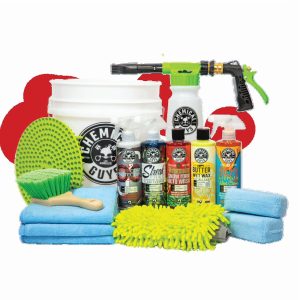
Chemical Guys HOL340 15-Piece Arsenal Builder Car Wash Kit with Foam Gun, Bucket, and (5) 16 oz Car Care Cleaning Chemicals, Gift for Car & Truck Lovers, Dads and DIYers (Works w/Garden Hose)
Original price was: CA$99.00.CA$55.00Current price is: CA$55.00. 44% Off Sale Add to cart -
Sale
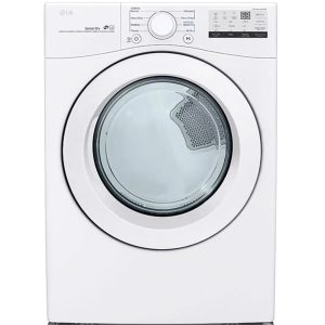
LG DLE3400W 7.4 Cu. Ft. White Front Load Electric Dryer
Original price was: CA$100.00.CA$50.00Current price is: CA$50.00. 50% Off Sale Select options This product has multiple variants. The options may be chosen on the product page -
Sale
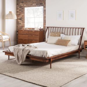
Walker Edison Modern Boho Queen Size Solid Wood Platform Bed, Walnut
Original price was: CA$105.00.CA$46.00Current price is: CA$46.00. 56% Off Sale Add to cart -
Sale
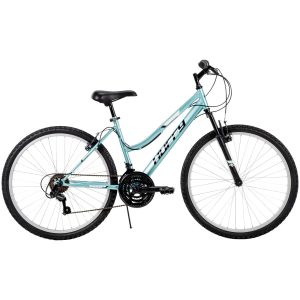
Huffy 26?Rock Creek Women’s 18-Speed Mountain Bike, Mint
Original price was: CA$103.00.CA$59.00Current price is: CA$59.00. 43% Off Sale Add to cart